Friday, September 30, 2011

Two Counties May Decide 2012 Election


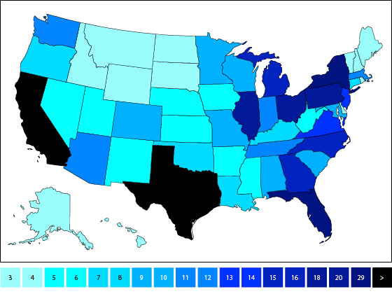
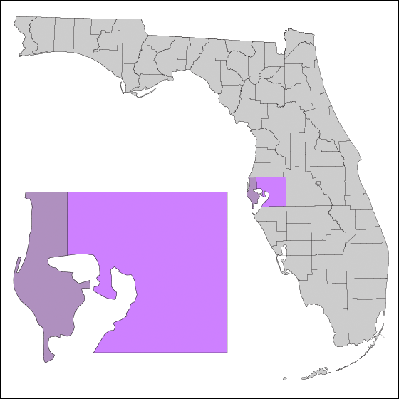
Above, from left: Pinellas county, Hillsborough county; state of Florida county map.

A few things to keep in mind going into the 2012 cycle:

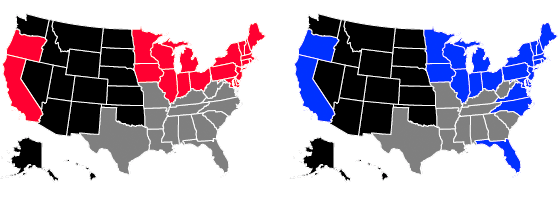
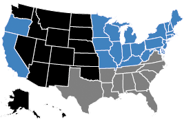
• For the past four cycles (the modern electoral era) Florida has gone with the winner.
• Since 1960, Hillsborough county has always gone with the winner.
• Within the past four cycles, it has gone to both parties twice.
• For the past four cycles, the margin of victory has never been >400k votes; total votes for Hillsborough county + Pinellas county in 2008 were just under 1 million.
• These two counties went to Obama in 2008; if he can hold them, all counties that did not go either exclusively D or R during the past four cycles could go R and he would still win the state in 2012, assuming all counties that have consistently gone either D or R continue to do so.
• The margin of victory in Hillsborough county tends to be relatively slim. In the hypothetical scenario where the county swings heavily toward Obama, he could take the state by winning all safe D counties and Hillsborough alone.

Tuesday, September 20, 2011

Defining Swing States, part 1

Above: President Obama's margin of victory/loss-by-state, 2008 (list)


Above: President Obama's margin of victory/loss-by-state, 2008 (vertical axis); electoral votes-by-state (horizontal axis). Shaded areas indicate electoral votes lost between 2008 and 2012; green areas indicate electoral votes gained. (list)

Friday, September 16, 2011

2012 Electoral College Data

Above: Electoral votes by state: 2012

Below: Change in number of electoral votes by state from 2008 to 2012

Above: Blue/red outlines indicate Obama/McCain states, respectively

Below: States by number of electoral votes

3 : AK, DC, DE, MT. ND, SD, VT, WY
4 : HI, ID, ME, NH, RI
5 : NE, NM, WV
6 : AR, IA, KS, MS, NV, UT
7 : CT, OK, OR
8 : KY, LA
9 : AL, CO, SC
10 : MD, MN, MO, WI
11 : AZ, IN, MA, TN
12 : WA
13 : VA
14 : NJ
15 : NC
16 : GA, MI
18 : OH
20 : IL, PA
29 : FL, NY
38 : TX

2012 GOP Primary Calendar

2/06/12 : IA
2/07/12 : MN, MO, NJ
2/14/12 : NH
2/18/12 : NV
2/21/12 : WI
2/28/12 : AZ, MI
3/06/12 : CO, ID, MA, OK, TN, TX, VT, VA, WY
3/10/12 : KS
3/13/12 : AL, HI, MS
2/20/12 : IL
3/24/12 : LA
4/03/12 : MD, DC
4/24/12 : CT, DE, NY, PA, RI
5/08/12 : IN, NC, OH, WV
5/15/12 : NE, OR
5/22/12 : AR, KY
6/05/12 : CA, MT, NM, SD
6/26/12 : UT
?            : AK, FL, GA, ME, ND, SC, WA
(read more)

Thursday, September 15, 2011

Party of Lincoln? Not So Fast.


Above: Electoral maps depicting Union member states as of 1860

Above-Left: Red indicates states that went to Abraham Lincoln (R) in 1860
Above-Right: Blue indicates states that went to Barack Obama (D) in 2008

It is worth noting that in 2008 VA, NC and FL were very close races and that the two maps could very easily have been identical.


Above: Grey indicates states to secede from the Union from 1860 to 1861 (WV seceded from the confederacy in 1863)


---


Above: Electoral pattern of the former confederacy from 1880 to 2008. Blue indicates Democratic identity, red indicates GOP identity, and green denotes a third party.


Tuesday, September 6, 2011

Limitations of Conventional Visualization

Q: Why not just use a line graph like everyone else?

A: The human brain seems to have settled on the line graph as the preferred mode of data-tracking. Clarity of presentation is key, but one must distinguish between noise-reduction and sacrificing crucial data to give the appearance of tidiness. Line graphs imply that there is a continuous data stream, rather than intermittent data points. Furthermore, a point on a line graph may consist of a single or multiple data points. A single data point is not a scientific sample, nor is the average of multiple data points from disparate and non-analogous sources; not to mention the discontinuity of various combinations of segueing data points concealed within a fluid-seeming graph that succeeds in encrypting valuable data that could easily be visualized otherwise, or the fact that points in time without any data are treated with the assumption that the most recent data stands until explicitly refuted, and that once refuted a line is simply drawn from it to the next point.

Q: When is a line graph "good"?

A: The optimal application of a line graph is to map a continuous stream of data. Since continuity entails the acquisition of infinite data-samples, we quickly find this condition to be unattainable. So while a line graph is never completely accurate, accuracy does increase with sample frequency. A daily tracking poll of president Obama's approval rating, for instance, would be much more suited to this mode of visualiztion than, say, a bi-monthly poll.

Examine the following graph:
GOP Primary 2012
(Polling conducted between 9/1/10 and 8/31/11)

Data points indicate activity-by-pollster over time. Dark blue bands indicate periods of heavy activity while the pinkish ares are periods of no activity. Observe how relatively scant the available data is (any line graphs on the topic ought to be taken with a grain of salt). And to use an audio-engineering analogy, one can easily "solo" or "mute" the activity of a particular pollster.

Friday, September 2, 2011

GOP Primary 2012
(Polling conducted between 1/1/10 and 8/21/11)


The following graphs are "Romney-centric" and quantify a no-poll for Perry on 2/2/10 as '0'; the first poll including Rick Perry was conducted from 11/15/10 to 11/18/10. The regression line projects into negative values and would extend to the left side of the graph. Quantifying a no-poll as '0' is a way of synchronizing/manipulating data, and in this example makes Perry's rise seem more meteoric (via the regression line), though at the expense of making the onset of the rise seem painfully gradual (via the line graph). All this aside, this is the correct way to compare Perry data to Romney data over the long term while preserving correlated timeframes and regression lines (observe how the the three graphs share a horizontal zoom level); the distortion results from trying to define Perry data in the long term to begin with. To obtain a more accurate Perry readout in the short term, we should set the baseline at the first available poll containing Rick Perry, or rather, at the point in time where contiguous polls containing Rick Perry first became available. But in creating this Perry-centric model, we also generate a new interpretation of the Romney data. The more objective solution would be to provide both Romney-centric and Perry-centric readouts.


Rick Perry


Mitt Romney


Here are the same graphs with three regression lines apiece, each with a different baseline date: from left to right, 2/2/10 (our previous baseline), 11/16/10 (the date of the first poll featuring Rick Perry), and 6/11/11 (the point at which Perry became a recurring cast member).


Rick Perry


Mitt Romney


As each trend line paints a different picture, one can clearly see how data must be observed not only at different points, but from different points in order for it to yield any real meaning. Inversely, it becomes obvious how, were one to wish to promote a particular set of "findings" all one need do is weed out undesirable baselines. In this instance, we could spin it either way: "since polling data on Rick Perry first became available (blue line), Mitt Romney's popularity has enjoyed a net increase" or "since consistent polling data on Rick Perry has became available (cyan line), Mitt Romney's popularity has been in sharp decline".