
GOP Primary 2012
(Polling conducted between 1/1/10 and 8/21/11)
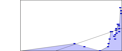
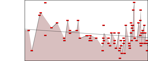
The following graphs are "Romney-centric" and quantify a no-poll for Perry on 2/2/10 as '0'; the first poll including Rick Perry was conducted from 11/15/10 to 11/18/10. The regression line projects into negative values and would extend to the left side of the graph. Quantifying a no-poll as '0' is a way of synchronizing/manipulating data, and in this example makes Perry's rise seem more meteoric (via the regression line), though at the expense of making the onset of the rise seem painfully gradual (via the line graph). All this aside, this is the correct way to compare Perry data to Romney data over the long term while preserving correlated timeframes and regression lines (observe how the the three graphs share a horizontal zoom level); the distortion results from trying to define Perry data in the long term to begin with. To obtain a more accurate Perry readout in the short term, we should set the baseline at the first available poll containing Rick Perry, or rather, at the point in time where contiguous polls containing Rick Perry first became available. But in creating this Perry-centric model, we also generate a new interpretation of the Romney data. The more objective solution would be to provide both Romney-centric and Perry-centric readouts.
Rick Perry
Mitt Romney
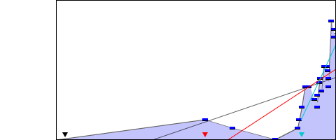
Here are the same graphs with three regression lines apiece, each with a different baseline date: from left to right, 2/2/10 (our previous baseline), 11/16/10 (the date of the first poll featuring Rick Perry), and 6/11/11 (the point at which Perry became a recurring cast member).
Rick Perry
Mitt Romney
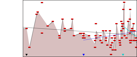
As each trend line paints a different picture, one can clearly see how data must be observed not only at different points, but from different points in order for it to yield any real meaning. Inversely, it becomes obvious how, were one to wish to promote a particular set of "findings" all one need do is weed out undesirable baselines. In this instance, we could spin it either way: "since polling data on Rick Perry first became available (blue line), Mitt Romney's popularity has enjoyed a net increase" or "since consistent polling data on Rick Perry has became available (cyan line), Mitt Romney's popularity has been in sharp decline".